

Bauhaus Conference
In this project, I envisioned a Bauhaus Conference set in Berlin, paying homage to one of the most impactful art movements of the early 20th century. Bauhaus revolutionized the world of graphic design, particularly typography, and its legacy continues to inspire new generations of designers. To bring this hypothetical event to life, I created a bespoke typeface exclusively for the conference and designed mockups to help immerse you in the experience.


Delving into the Art and Science of Typography, Culminating in the Creation of a Brand New Typeface.
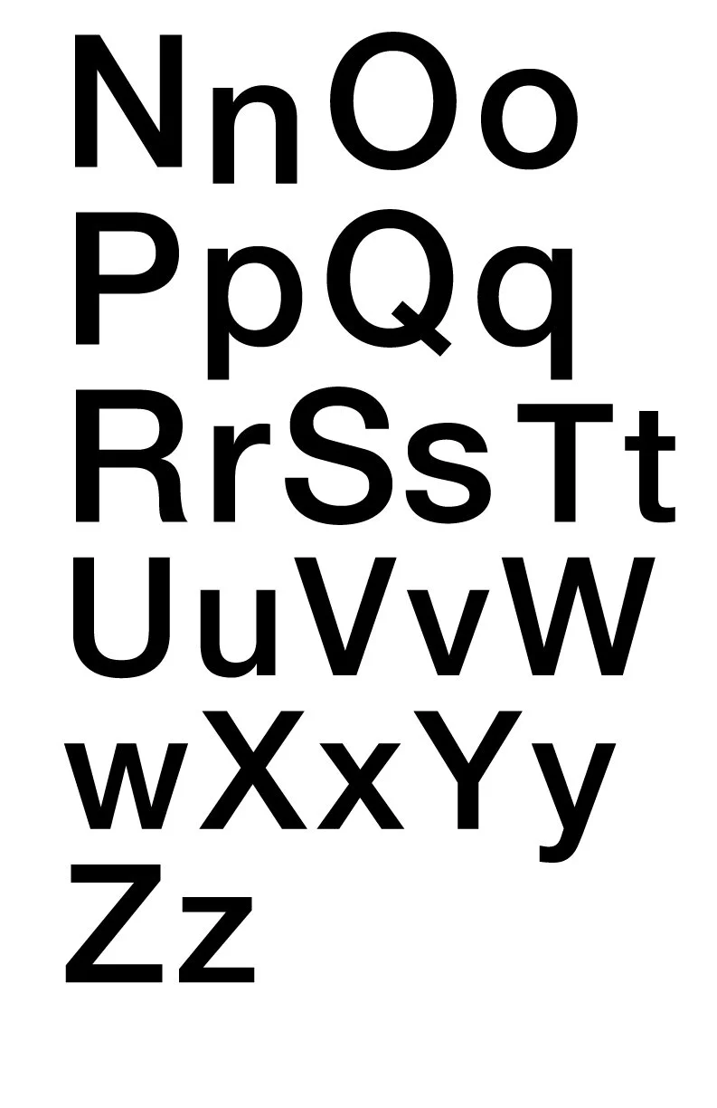
As the saying goes, "practice makes perfect," and that was precisely my approach when creating a brand new typeface. Through the use of an advanced grid system and the manipulation of figure and ground, counter forms, and other components, I crafted a typeface that embodies the essence of the Bauhaus era. By employing simple shapes, I was able to evoke the movement's influence on art, which continues to reverberate in every aspect of design today.
Utilitarian Approach.
At the heart of Bauhaus was the aim to create designs that seamlessly integrated with human interactions and their surroundings. This was achieved through a utilitarian approach to design that prioritized function over form, using only what was necessary. I applied this same philosophy to the creation of these posters, with each one serving as a representation of Bauhaus, whether viewed in conjunction or individually.
Simple Shapes, Colors and Vision.
Simple shapes, colors, and a clear vision were instrumental in making this project possible. By utilizing simple geometric shapes, I was able to create a clean and modern aesthetic that is reminiscent of the Bauhaus style. The use of primary colors in the designs further emphasizes the movement's philosophy of minimalism and utilitarianism. This approach allowed me to capture the essence of Bauhaus design without compromising on the quality of the final product.
A clear vision was also essential to the success of the project. With a deep understanding of the Bauhaus style and its principles, I was able to create designs that were true to the movement's philosophy while also bringing my own creative interpretation to the table. This clarity of vision allowed me to create cohesive designs that were not only visually appealing but also conveyed the message and ideas behind the project.
In conclusion, the use of simple shapes, colors, and a clear vision were crucial in making this project possible. These elements allowed me to capture the essence of Bauhaus design while also infusing my own unique style and interpretation into the work.


